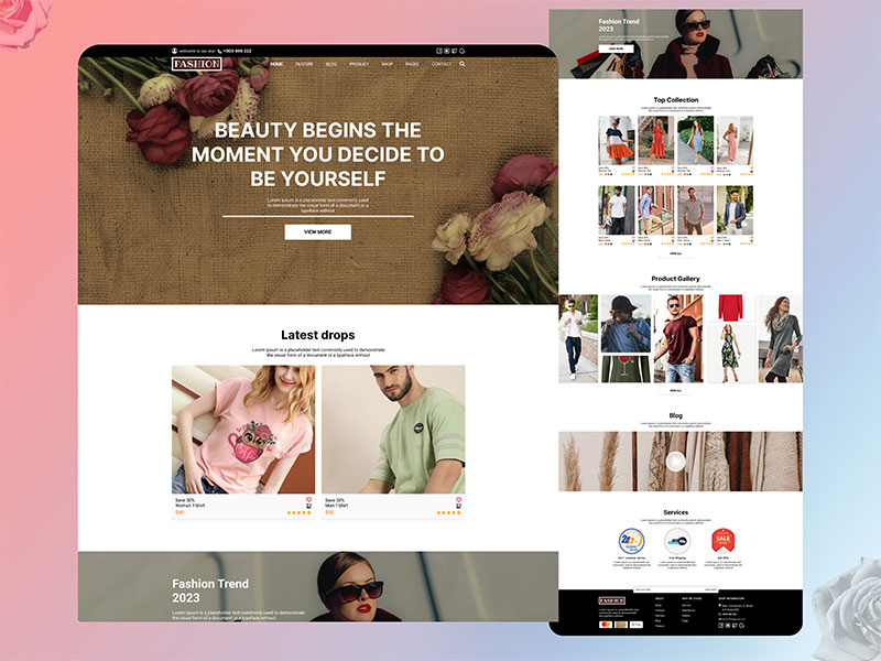
Nowadays, almost every business from small scale to large is available on eCommerce for expanding their net worth. Therefore, it is not very simple and easy to do eCommerce website development and get business from it. Are you also one of the businesses wondering what is hindering you to target your customers online? Well, you may or maybe not committing sins of eCommerce website development and are unaware of the same. Read further to understand.
eCommerce websites should not only look good, but they should function well too. A poorly designed website will make users frustrated and leave them without any desire to return. If you have ever visited a site where everything was just thrown together, then you know what I am talking about.
You may find yourself clicking around aimlessly trying to figure out how to navigate the site. When you finally get to the page you were looking for, you may even feel annoyed at having wasted time searching for something that could have been easily located if the site had been properly designed.
Sins of eCommerce website development:
- Poor SEO (Search Engine Optimization):

It means having no search engine optimization. If you want people to find your website, then you need to have good SEO. Make sure your website appears naturally without being forced. You can opt for a seo company in India that takes care of the website’s SEO and helps your brand to grow. Also, don’t forget about social media! Share your posts on Facebook, Twitter, Instagram, etc. Don’t just post once a week; share often.
2. Bad Web design:

Design is what makes your website look nice. A bad design looks unprofessional and unattractive. When designing your website, think about how you want it to look. What colors should you use? How big should your fonts be? Is your background image right? Before you begin, consider these questions. We are a leading web design company in Toronto and India, that can help you design your site.
3. Slow Loading Speed:
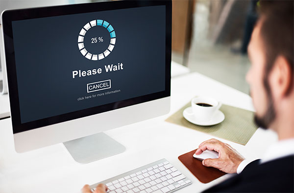
If your website takes longer than 2 seconds to load, then you’re doing something wrong. People won’t wait around if your website isn’t quick enough. You should be able to load your website in less than two seconds. If it takes longer, you’ll lose potential customers.
4. No Mobile Optimization:

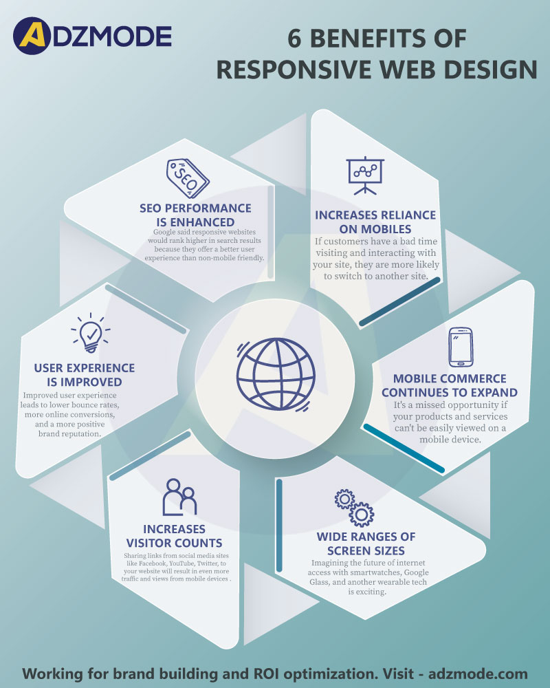
Mobile devices are becoming increasingly popular these days. More and more people are using smartphones and tablets to browse websites. If your website doesn’t have a mobile version, you’re missing out on a lot of traffic. Mobile users tend to spend more time browsing sites than desktop users. So, you’ll get more visitors if you create a mobile-friendly version of your website.
Visit: tips to build a successful website
5. Broken Links:

It means that someone accidentally deleted a page from your website. If you notice any broken links, fix them ASAP.
6. Too much Advertising:

You shouldn’t put ads everywhere on your website. Ads take away from the user experience. They slow down the loading speed of your website. Plus, they distract users from reading your content.
7. Poorly Written Content:

The first thing people notice about any website is its content. If the information provided is not relevant, then the user is going to click away immediately. Users do not want to read long-winded articles that have nothing to offer them. Keep the text short and sweet.
8. Bad Navigation Structure:

Navigation structure refers to how users move around your site. A good navigation system should make sense, be logical, and be easily accessible. When visitors land on your site, they should know where they are supposed to go, what they’re looking for, and how to get there.
Visit: web3 content marketing
9. Unclear Call To Action (CTA):

When you’re designing a call to action, think about who is using your site and what they’re trying to accomplish. What would motivate someone to take action? Would they need to purchase something? Sign up for a newsletter. Fill out a contact form. Make sure that whatever CTA you choose is visible and makes sense given the goal of your page.
10. Too Many Images:

Images are great, but having too many images on a single page takes valuable space away from the actual content. Keep your image sizes consistent, and use CSS/HTML techniques to reduce the number of files you’re including.
Visit: image seo tips
11. No Privacy Policy:

Privacy policies inform consumers about their personal information being collected and shared. Consumers expect companies to protect their privacy and provide clear guidelines regarding how their data is handled. Companies that fail to comply with these expectations risk losing customers’ trust.
12. Lack of Security:

Security measures help prevent unauthorized access to sensitive information stored on a website. Hackers frequently target websites that lack security features, stealing valuable information and causing financial losses.
Summing up,
Your goal as a business owner is to keep your clients coming back for more of your products or services. The importance of taking care of our customers and building their loyalty cannot be overstated. Therefore, make sure you take care of the various Sins of eCommerce Website development that might harm your website as well as your potential clients. Good Luck!
Why Adzmode for Your eCommerce Project?
- 1000+ Projects Delivered
- More than 800 happy clients across the globe
- Managing Website Development Since 2006
- Fully Optimized Product Pages
- Expert Content Writers
- Founded by team of IIT Delhi Certified Digital Marketers
- 100% Transparency in Operations and Ad Budgets.
Share Your Project Requirements With Us

